The context
A rebrand with no visual infrastructure behind it
My first step was not execution, it was audit. I mapped every existing touchpoint to understand where visual consistency was breaking down and why content was not converting. Video was too long and misaligned with buyer stage; the website was product-feature-focused rather than outcome-focused; and there was no system connecting any of it.
The strategic decision was to build a visual system first, a set of standards that would govern every output, before touching any individual piece. That meant holding off on quick fixes in favor of a foundation that would scale.
The problem
Generic visual identity, feature-focused messaging, no brand through-line connecting any channel to any other.
The approach
Diagnose, build the visual system, then execute. Video, web, social, email, events, thought leadership, and internal comms as a connected whole.
My role
Creative lead with full content strategy ownership. Visual direction, cross-functional alignment, production, and performance accountability.
Timeframe
2023 to present. Ongoing with compounding results as more channels adopt the same language.
Done in 2025. I led visual design strategy in partnership with Algert agency for web execution. The goal was to move from a generic, feature-focused aesthetic to a brand built around the energy of live events, bold, results-forward, and recognizable across every channel.
Website redesign
Generic visual identity, feature-focused messaging vs. Bold venue energy, results-forward design
Product animations
The new site brought product animations to life, kinetic, intentional motion that communicated software capability without a word of copy.
Brand guidelines
A full brand standards document governing typography, color, photography, motion, and usage rules, so any future output could maintain the system without starting from scratch.
VenuePulse newsletter
The brand system extended to the VenuePulse prospect newsletter, consistent visual language at every touchpoint in the buyer's journey.
VenuePulse, Insights for venue and event leaders
Quarterly report
The quarterly report was a full brand expression, PDF, social graphics, and supporting assets, all consistent with the new visual system.
Social graphic, quarterly report launch
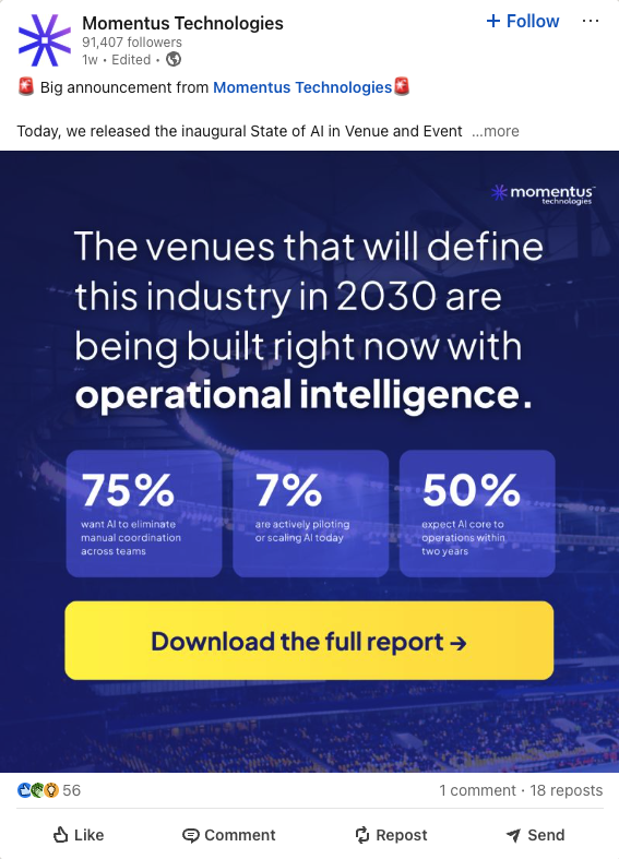
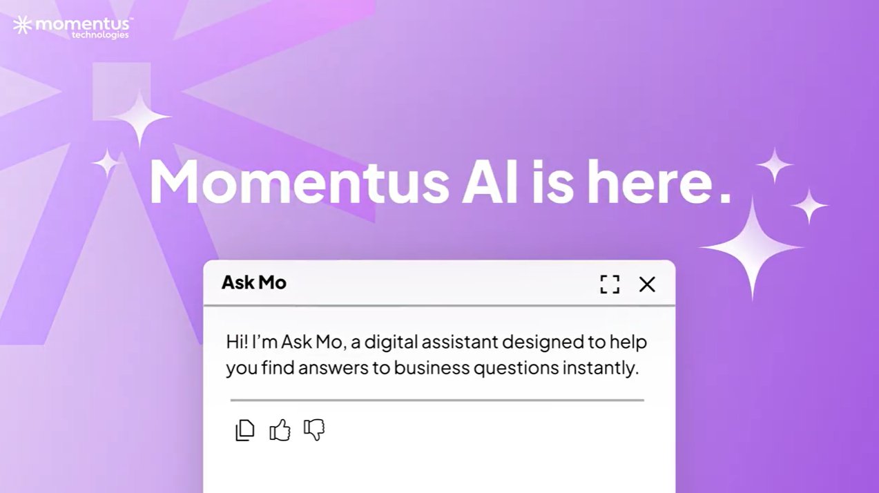
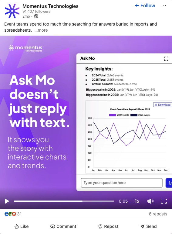
Ask Mo was the launch campaign for Momentus AI, a fully integrated, multitouch campaign spanning promo video, web landing page, social, and email. Each channel was built to reinforce the others and drive toward a single conversion goal: demo bookings.
Promo video
Designed to announce Momentus AI to the market and drive immediate demo requests. Short, energetic, and built to communicate the product value proposition before a prospect loses interest.
Web landing page
The Ask Mo landing page was designed to move prospects from awareness to demo request in a single session. Visual-first, results-forward, and built around the product experience.
Ask Mo, Product Landing Page
gomomentus.com/ask-mo
Social
Ask Mo social cutdown, LinkedIn
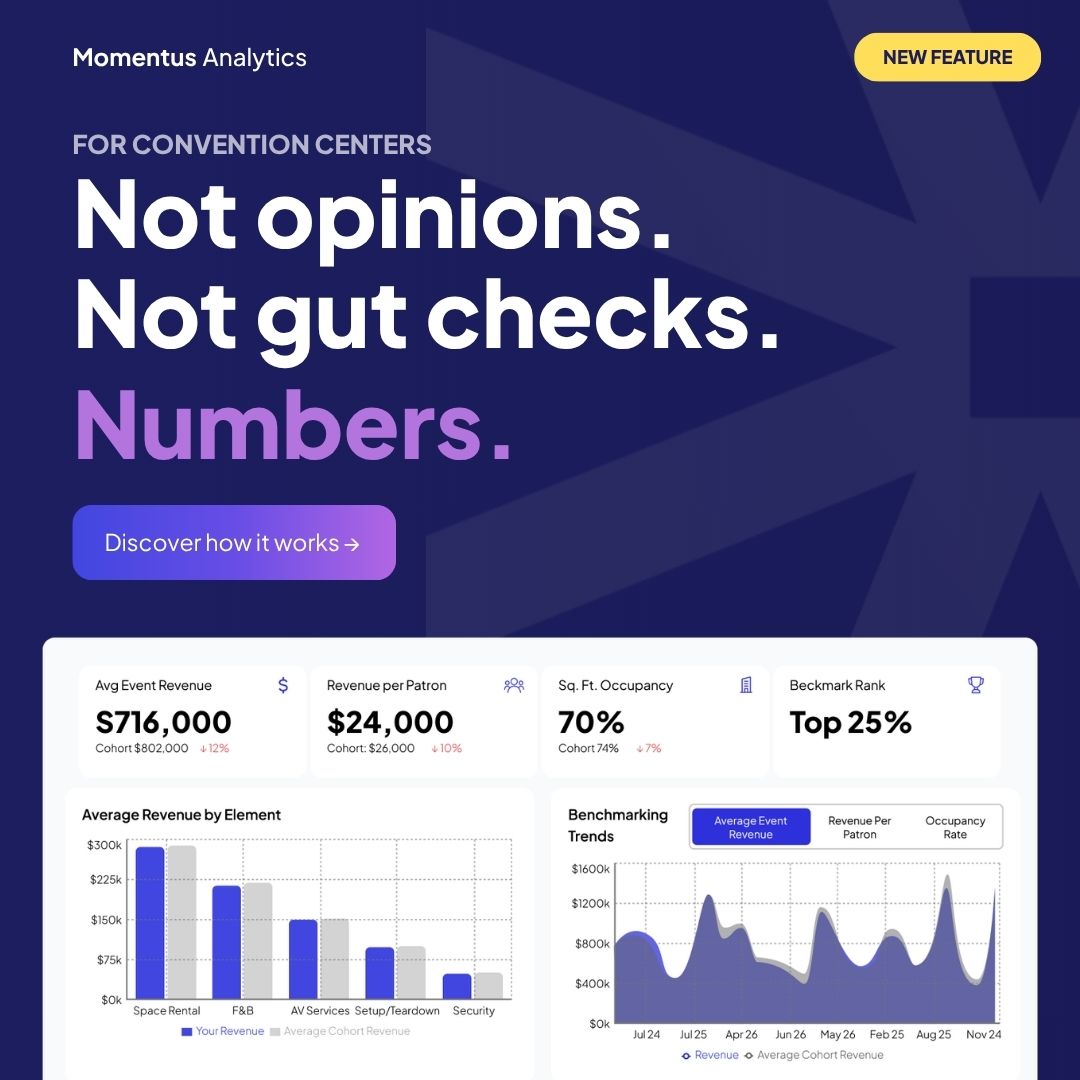
Momentus Analytics, product feature launch
Campaign results
The landing page went live on a Tuesday. By Wednesday morning, 36 demo meetings were booked. The launch email hit a 34% open rate, well above the B2B benchmark of 20-25%. The webinar that followed drew 289 registrants and a 48% attendance rate, nearly double the industry average, with a 4.2/5 satisfaction score.
vs. 20-25% B2B avg
vs. 35% industry avg
4.2/5 satisfaction score
I made the case internally for treating YouTube as a full-funnel content platform. 252% subscriber growth and 135% view increase between January and July 2025 followed. Two series drove that growth: the Innovators Series and the WeTrack collaboration.
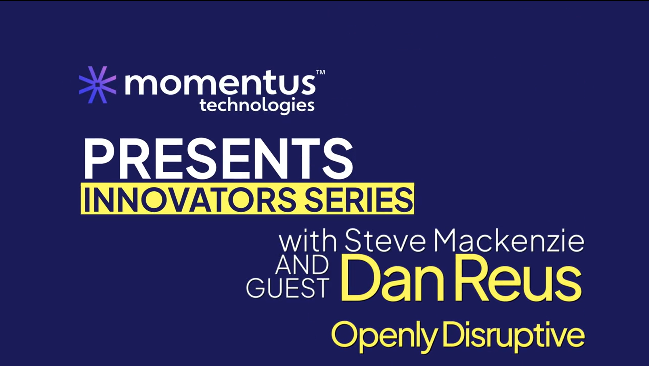
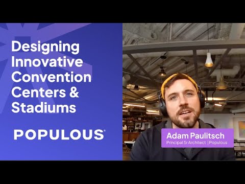
Innovators series
The series got a full visual overhaul, from a basic title card to a bold, on-brand production identity. Then the content followed.
Before, original title frame
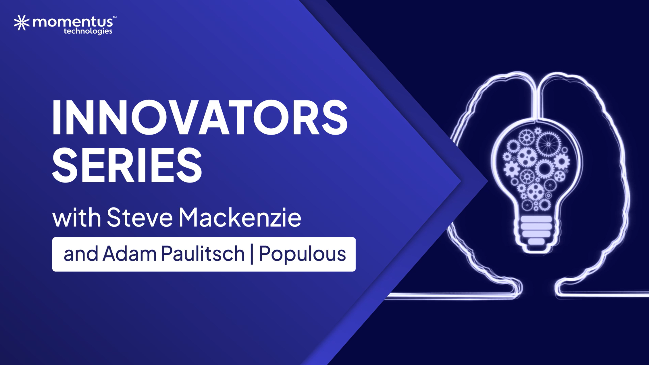
After, redesigned series identity
Featuring Populous, one of the world's leading stadium and arena architecture firms, as the first interview was intentional. Their credibility transferred.
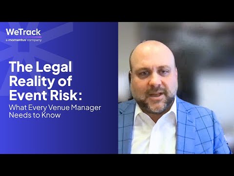
WeTrack series
A contributed series in partnership with WeTrack, venue and event industry intelligence. The collaboration extended Momentus's reach into a new audience of venue professionals who hadn't yet encountered the brand.
Client showcase content was built for longevity, each asset designed to work across email, website, and social so a single production created multiple touchpoints. The goal was to let customer credibility do the heavy lifting at every stage of the buyer journey.
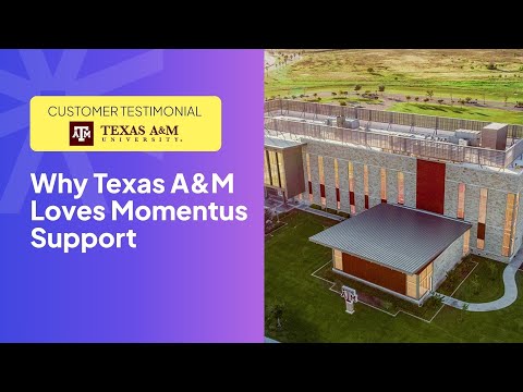
Social graphic, Kindra Fry, Texas A&M
.jpg)
Quote graphic for social and email, Texas A&M
Video, Texas A&M
Customer story video featuring Texas A&M's Kindra Fry on how Momentus helps their events team. Used across web, email campaigns, and social for ongoing demand generation.
Experiential work pushed the brand into physical space, stadium screens, live event signage, and a multi-city roadshow campaign targeting venue and event decision-makers in their own cities.
Illuminate, Accor Stadium, Sydney
Brand assets displayed at Accor Stadium during the Illuminate event. 83,000 seats, one visual system. The ultimate proof that a brand built for consistency holds up at scale.
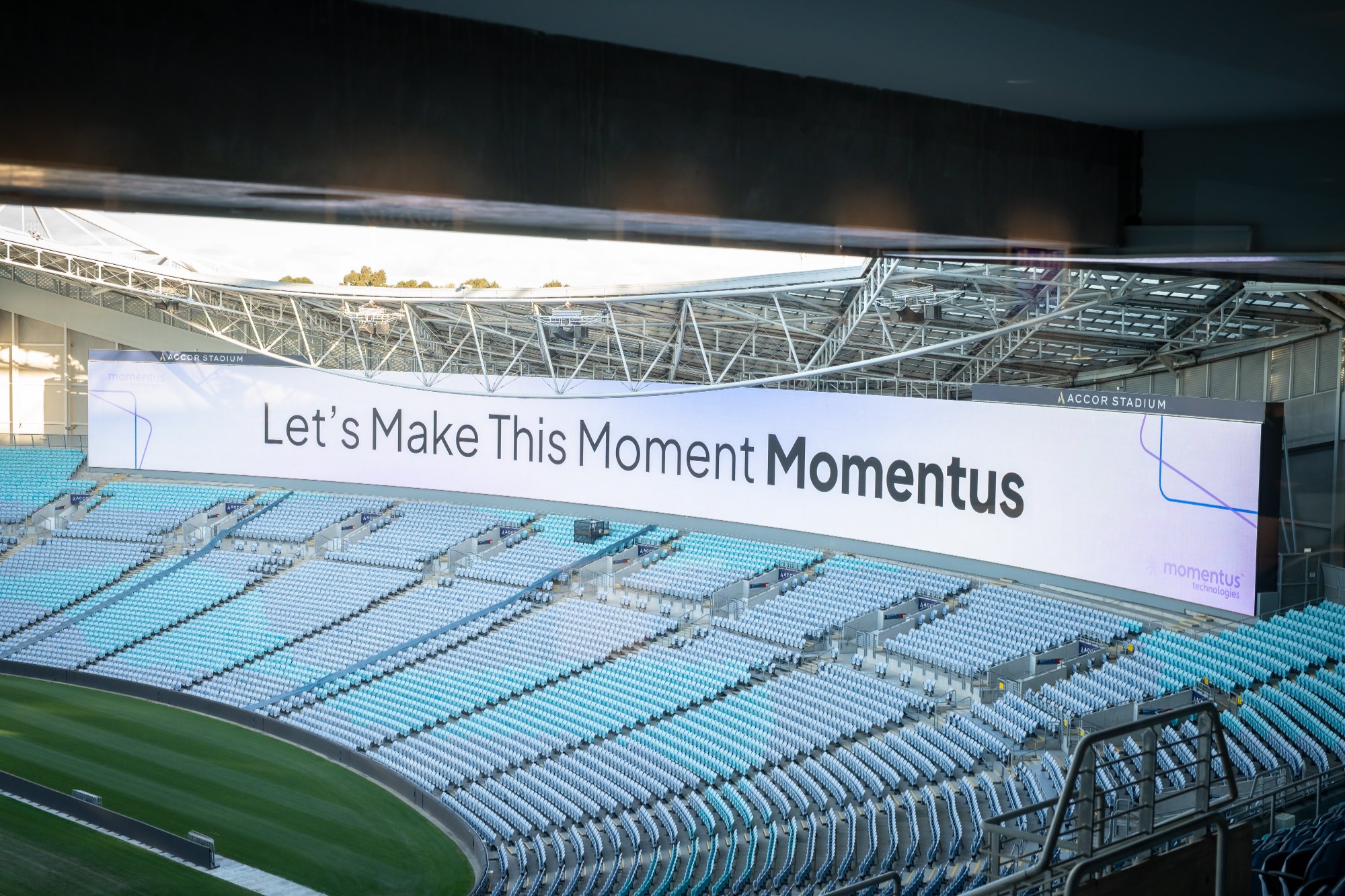
Accor Stadium, Sydney, "Let's Make This Moment Momentus"
Roadshow email campaign
A multi-city roadshow series targeting venue and event leaders. Each email was built to feel like an exclusive invitation, city-specific, visually bold, and conversion-focused.
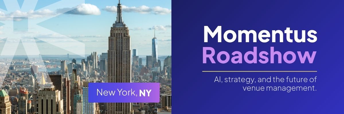
Roadshow email, New York, NY
Results
A system that moved the business
Grouped by impact area
Demand generation
Brand and web
Content and video